Signaletik Alters- und Pflegezentrum Wägelwiesen
Signaletik auf den Punkt gebracht!
Wie kann man in einem Alters- und Pflegezentrum dafür sorgen, dass sich jeder zurechtfindet?
Mit Punkten natürlich! Farbige Punkte leuchten fröhlich wie Konfetti an Wänden, Schildern und auf Glasflächen des Alters- und Pflegezentrums.
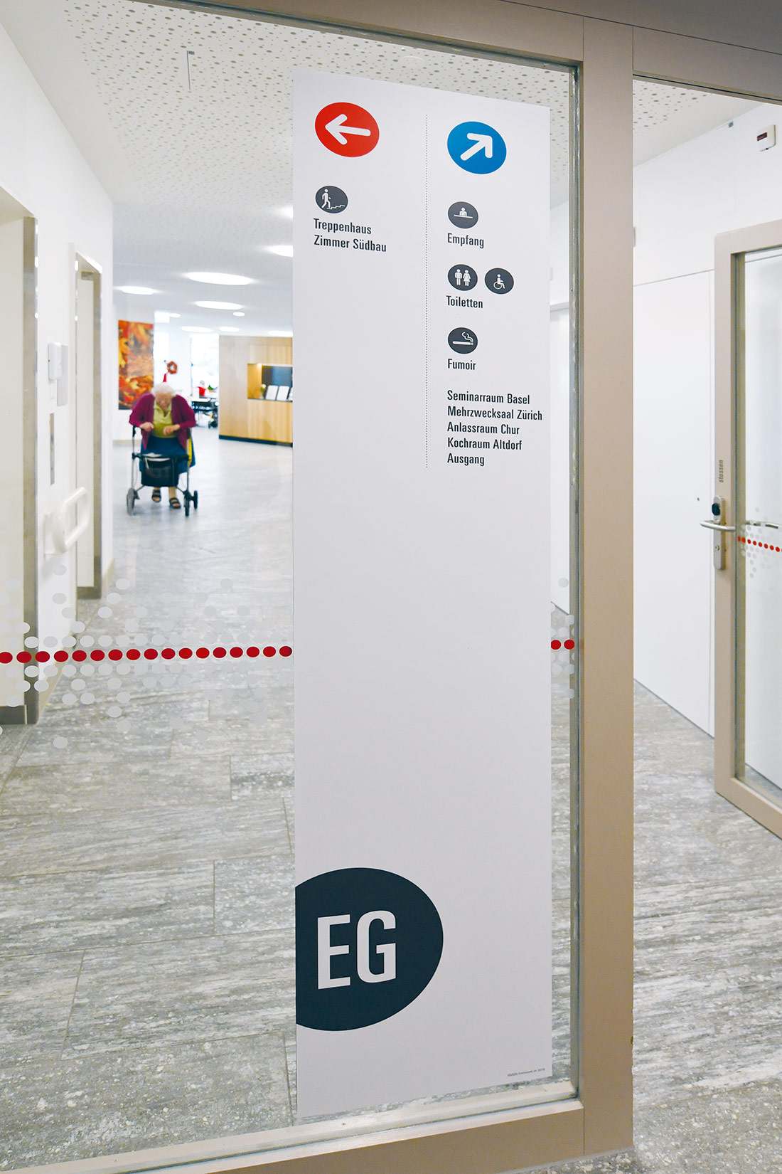
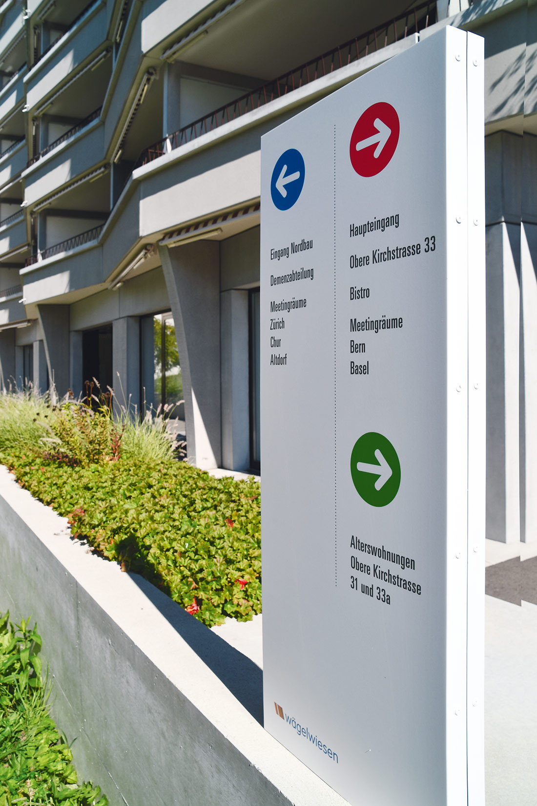
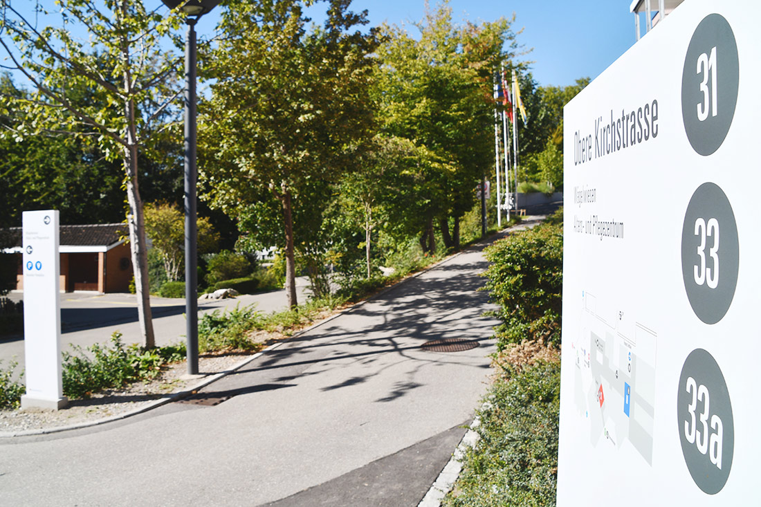
Suchende erkennen anhand der jeweiligen Farbe schnell, in welchem der drei Bereiche sie sich bewegen. Um den Alt- und Neubau farblich zu unterscheiden, wurden drei Bereichsfarben eingesetzt. Der Nordflügel ist ganz in Blau gehalten und der Südteil in Rot. Die Alterswohnungen an den Standorten, Obere Kirchstrasse 31 und 33a, sind grün markiert.
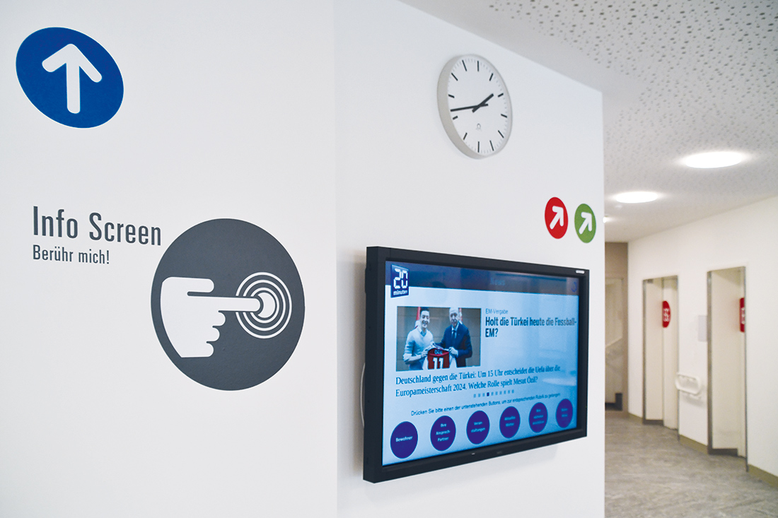
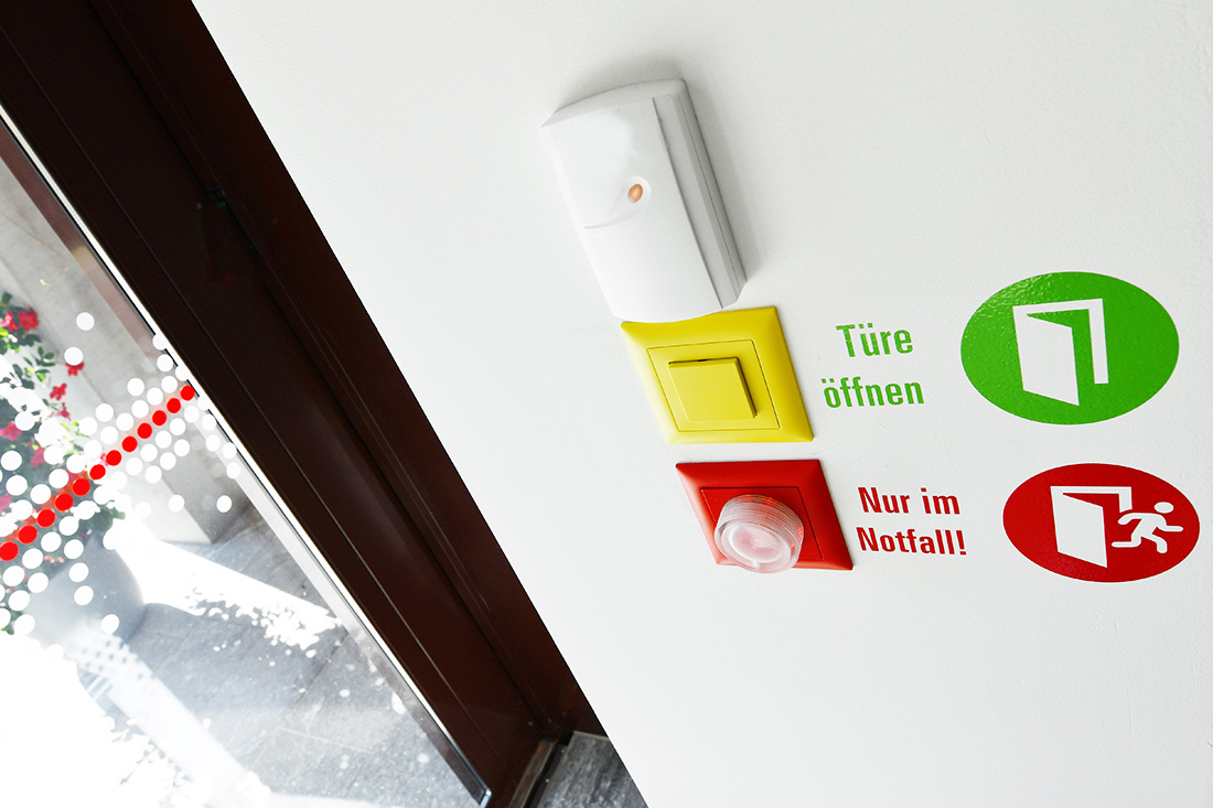
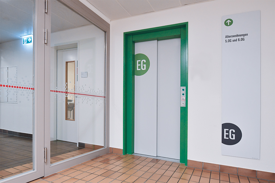
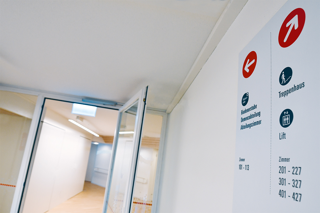
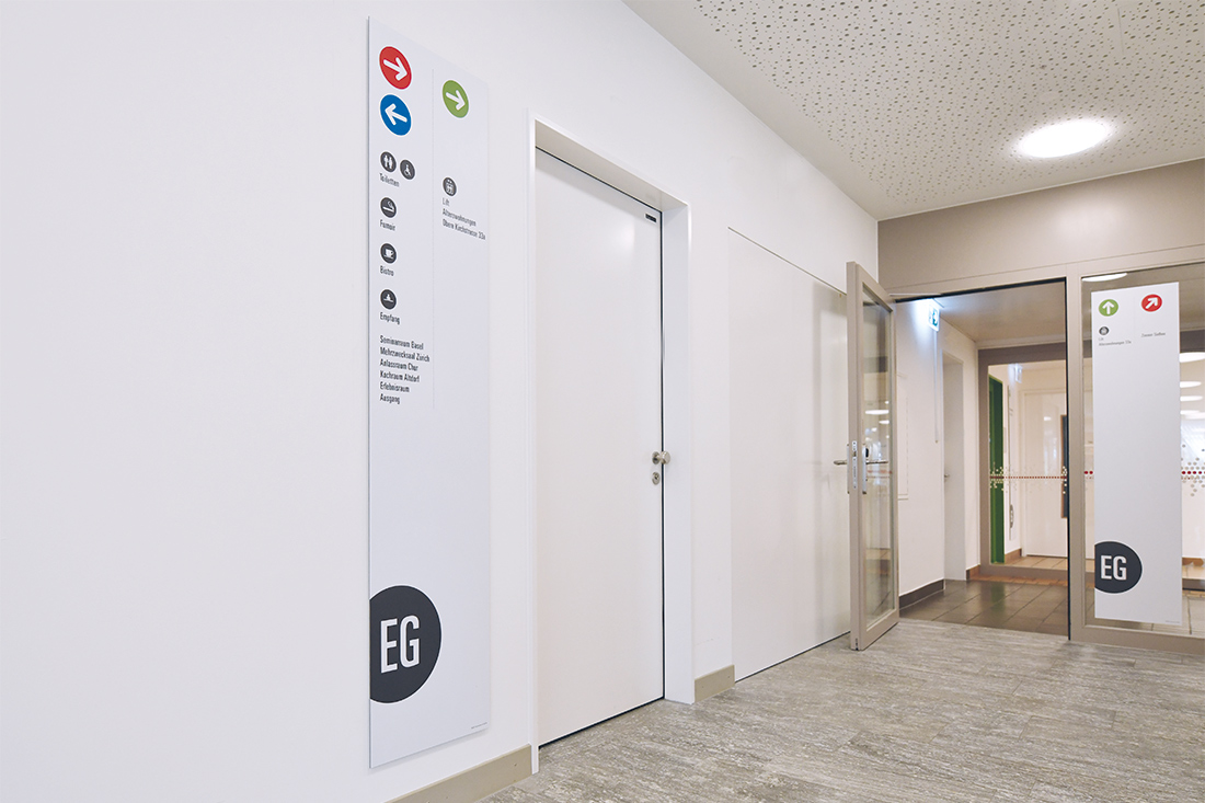
Der farbige Punkt als Wegweiser durch die Gebäude findet sich auf den Glasschiebetüren im Eingang, auf dem Sichtschutz, aber auch in der Geschossbeschriftung.
Selbst bei den Orientierungstafeln am Lift und auf den Etagen arbeiten wir mit dieser Form- und Farbgebung. Auch die unterirdischen Weg-Verbindungen folgen dem Punkteprinzip. Auf diese Weise können sich Bewohner und Besucher einfach orientieren und finden sich sicher zurecht.

Pünktlich ankommen …
Der Punkt war kein zufälliges Design, er wurde als Wiedererkennungs-Element aufgenommen. Die bestehenden runden Deckenelemente und auch der Brunnen in der Einfahrt, legten diese Wahl nahe. Die Wiedererkennung beginnt bereits bei den Stelen im Aussenbereich und wird von dort ins Innere der Gebäude konsequent durchgezogen. Die kreisrunden Öffnungszeiten im Bistro oder auch die Ortskennzeichnung der Parkplätze in der Garage sorgen dafür, dass jeder «pünktlich» dort landet, wo er möchte.
Leichtigkeit für betagte Bewohner
Wie kann man den Lebensraum von betagten Menschen einfacher gestalten, ohne dabei zu stören? Indem man sie neugierig macht! Es mögen die bunten Farben gewesen sein, die die Bewohner tatsächlich neugierig stimmten. Oft wurde unser Team gefragt, was passiert und was nun entsteht. Für uns war es eine willkommene Abwechslung und ein schönes Schaffen – da wir den direkten Kontakt mit den Menschen vor Ort genauso sehr geniessen konnten, wie sie selbst.
Menschliche Kommunikation
Die ganz besondere Anforderung in diesem Projekt formulierte der Zentrumsleiter Roland Fankhauser selbst. Sein Wunsch war, dass der laufende Betrieb reibungslos weitergeht.
Alle – Bewohner, Besucher und Mitarbeiter sollten sicher ihren Weg finden. Dass Signaletik in Gesundheitsbauten immer auch zur Kommunikation beiträgt und die Wege so nachhaltig im Gedächtnis verankert, ist ein schöner Nebeneffekt.
Testimonial: Liebevoll und vor allem sehr menschlich
Herr Roland Fankhauser bemerkte nach der Umsetzung: «Im Projekt entstand viel mehr als nur den Alt- und Neubau als eine Einheit zu präsentieren oder mit neuen Wegweisern auf die zusätzlichen Alterswohnungen und Seminarräume mit separatem Eingang hinzuweisen. Die Arbeit von Frontwork verlief professionell, reibungslos und konstruktiv – aber auch besonders liebevoll und vor allem sehr menschlich.»
Während des Neubaus, oder besser gesagt, des (Alt)-Verbindungsbaus hat Frontwork die gesamte Signaletik überarbeitet und die bestehende ersetzt. Eine Orientierungslösung und ein leichtverständliches Designkonzept wurde gefunden. Die einheitliche Beschriftung sorgt für mühelose Orientierung innerhalb und zwischen allen Häusern.
Zusätzlicher Kundennutzen
Jedes Element, das erarbeitet wurde, ist codiert und wurde systematisch festgehalten. Der Kunde kann jederzeit Änderungen oder Nachbestellungen tätigen. Wegweiser können dadurch einfach, zeitsparend und unmissverständlich ersetzt, gewechselt oder nachbestellt werden.

Unser Fazit
Wir haben die Signaletik auf die individuellen Bedürfnisse der Bewohner, Besucher und Mitarbeiter ausgerichtet. Zu spüren, wie die Bewohner auf unsere Arbeit reagierten, war ein ganz besonderes Erlebnis. So konnten wir doch Eines feststellen: Wir tragen zu mehr bei, als nur zur Ortskennzeichung oder Signaletik in Gesundheitsbauten – wir sorgen für positiven Gesprächsstoff und machen den Alltag etwas «bunter». Wir sind überzeugt, dass wir mit dem erfolgreichen Abschluss des Projekts nicht nur bei der Zentrumsleitung «punkten» konnten – ein sehr schönes Gefühl!